Docs
Learn
TinaCMS provides a variety of pre-built components (plugins) you can use via the ui.component property.
Set the property to the plugin name as a string.
This only modifies the editor – underlying data stored depends on the field type used.
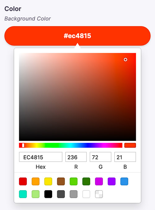
{type: 'string',label: 'Background Color',name: 'color',ui: {component: "color",colorFormat: "rgb"}}
You can pass in additional plugin configurations viaui– such ascolorFormatin the above example.
Plugin library
The default input type for the number field type.
To use, set ui.compontent to "number".
Provides a color selector with RGB or hex return values.
To use, set ui.compontent to "color".
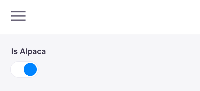
The default input type for boolean field types.
To use, set ui.compontent to "toggle".
To use, set ui.compontent to "radio-group".

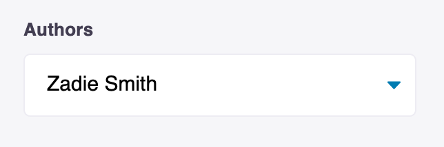
By default used for scalar types with an options property defined.
To use, set ui.compontent to "select".
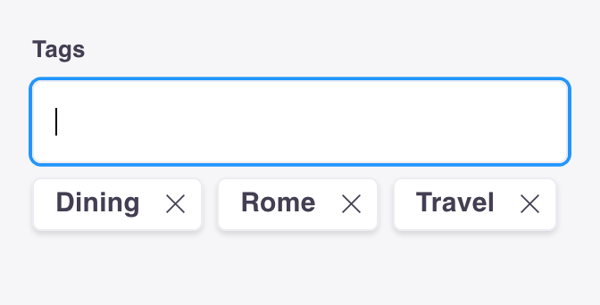
To use, set ui.compontent to "tags".
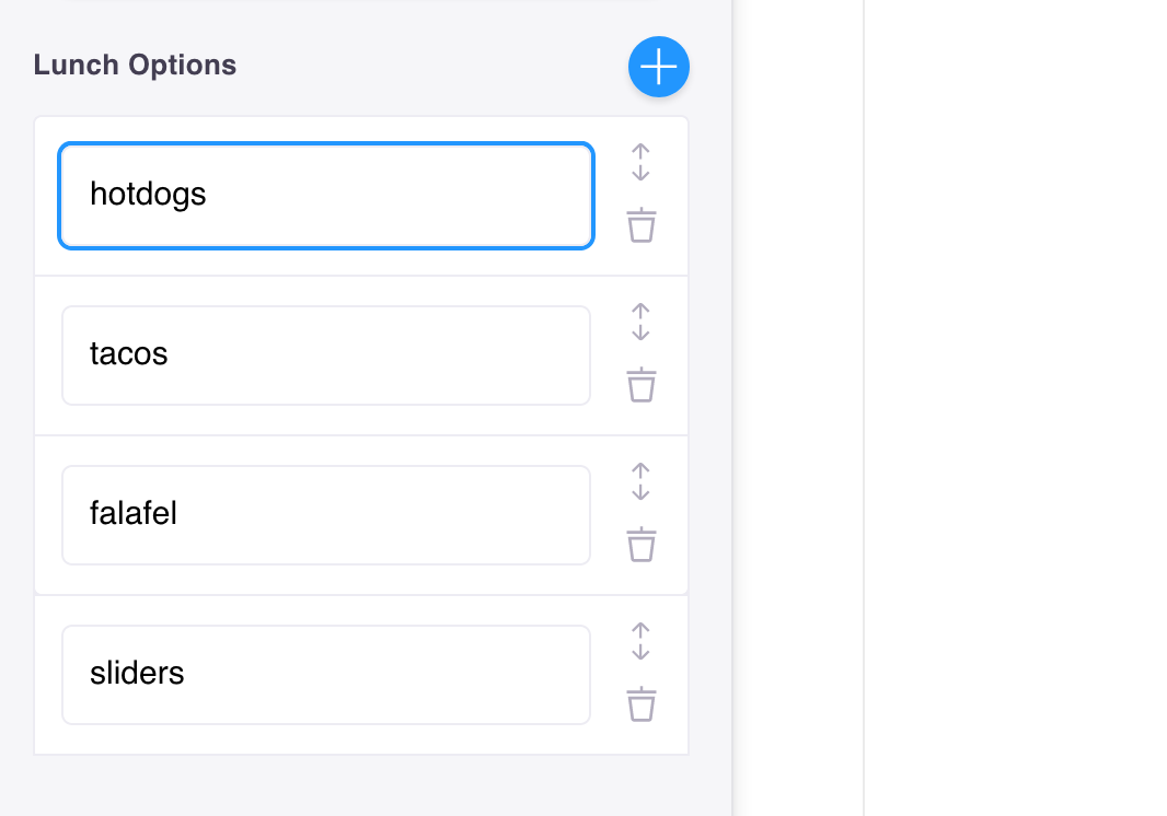
The default input type for managing list: true field types.
To use, set ui.compontent to "list".
To use, set ui.compontent to "group".

To use, set ui.compontent to "group-list".

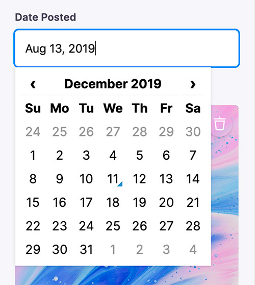
The default input type for selecting dates with a date picker.
To use, set ui.compontent to "date".
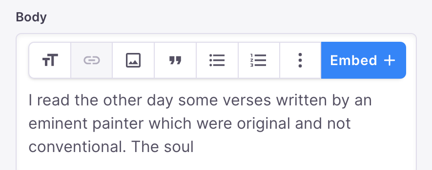
The default input type for editing markdown content with a rich text editor.
Requires additional setup – import and registration from an additional package.
The default input type for editing HTML content with a rich text editor.
Requires additional setup – import and registration from an additional package.

© TinaCMS 2019–2025